
LIFELINE
LIFELINE
LIFELINE
No One Picked Up
No One Picked Up
No One Picked Up
Graphis New Talent Awards 2025
Graphis New Talent Awards 2025
Graphis New Talent Awards 2025
graphic design
graphic design
graphic design
branding
branding
branding
illustration
illustration
illustration
LIFELINE is a solo branding project capturing the raw, introspective energy of a fictional emo rock band. Inspired by the 2010s emo revival, it resonates with the alternative and emo communities.
As the sole designer, I crafted visuals using illustration, typography, and graphic design, creating a dark, grunge-inspired identity that mirrors the band's emotional and rebellious music.
Research
Research
Research
For LIFELINE’s branding, I researched bands like Deftones, Slipknot, and Escape the Fate, analyzing their logos, typography, and overall aesthetics to capture the intensity of the genre. I studied how they balanced grunge, aggression, and atmosphere, using that insight to craft a distinct identity for LIFELINE.
For LIFELINE’s branding, I researched bands like Deftones, Slipknot, and Escape the Fate, analyzing their logos, typography, and overall aesthetics to capture the intensity of the genre. I studied how they balanced grunge, aggression, and atmosphere, using that insight to craft a distinct identity for LIFELINE.
For LIFELINE’s branding, I researched bands like Deftones, Slipknot, and Escape the Fate, analyzing their logos, typography, and overall aesthetics to capture the intensity of the genre. I studied how they balanced grunge, aggression, and atmosphere, using that insight to craft a distinct identity for LIFELINE.

Logo Creation
Logo Creation
Logo Creation
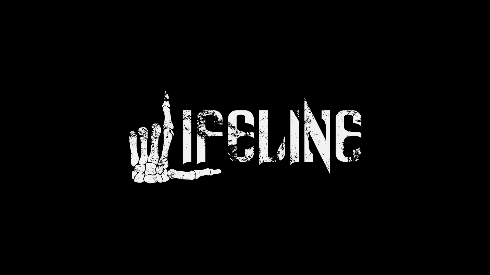
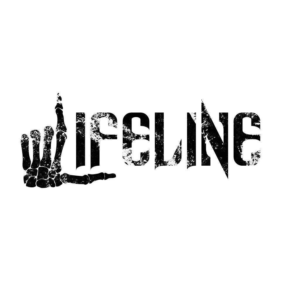
The project started with a bold logotype—a skeletal hand forming an "L," a striking symbol of the band's identity. The name appears in Spinebiting, a razor-sharp typeface that amplifies its edge. This skeletal theme carries into the debut album No One Picked Up, visually echoing its themes of isolation and longing for connection.
The project started with a bold logotype—a skeletal hand forming an "L," a striking symbol of the band's identity. The name appears in Spinebiting, a razor-sharp typeface that amplifies its edge. This skeletal theme carries into the debut album No One Picked Up, visually echoing its themes of isolation and longing for connection.
The project started with a bold logotype—a skeletal hand forming an "L," a striking symbol of the band's identity. The name appears in Spinebiting, a razor-sharp typeface that amplifies its edge. This skeletal theme carries into the debut album No One Picked Up, visually echoing its themes of isolation and longing for connection.
PRIMARY LOGO
PRIMARY LOGO
PRIMARY LOGO

ICON ONLY
ICON ONLY
ICON ONLY


BRANDING PALETTE AND TYPOGRAPHY
BRANDING PALETTE AND TYPOGRAPHY
BRANDING PALETTE AND TYPOGRAPHY

BRANDING PALETTE AND TYPOGRAPHY
BRANDING PALETTE AND TYPOGRAPHY
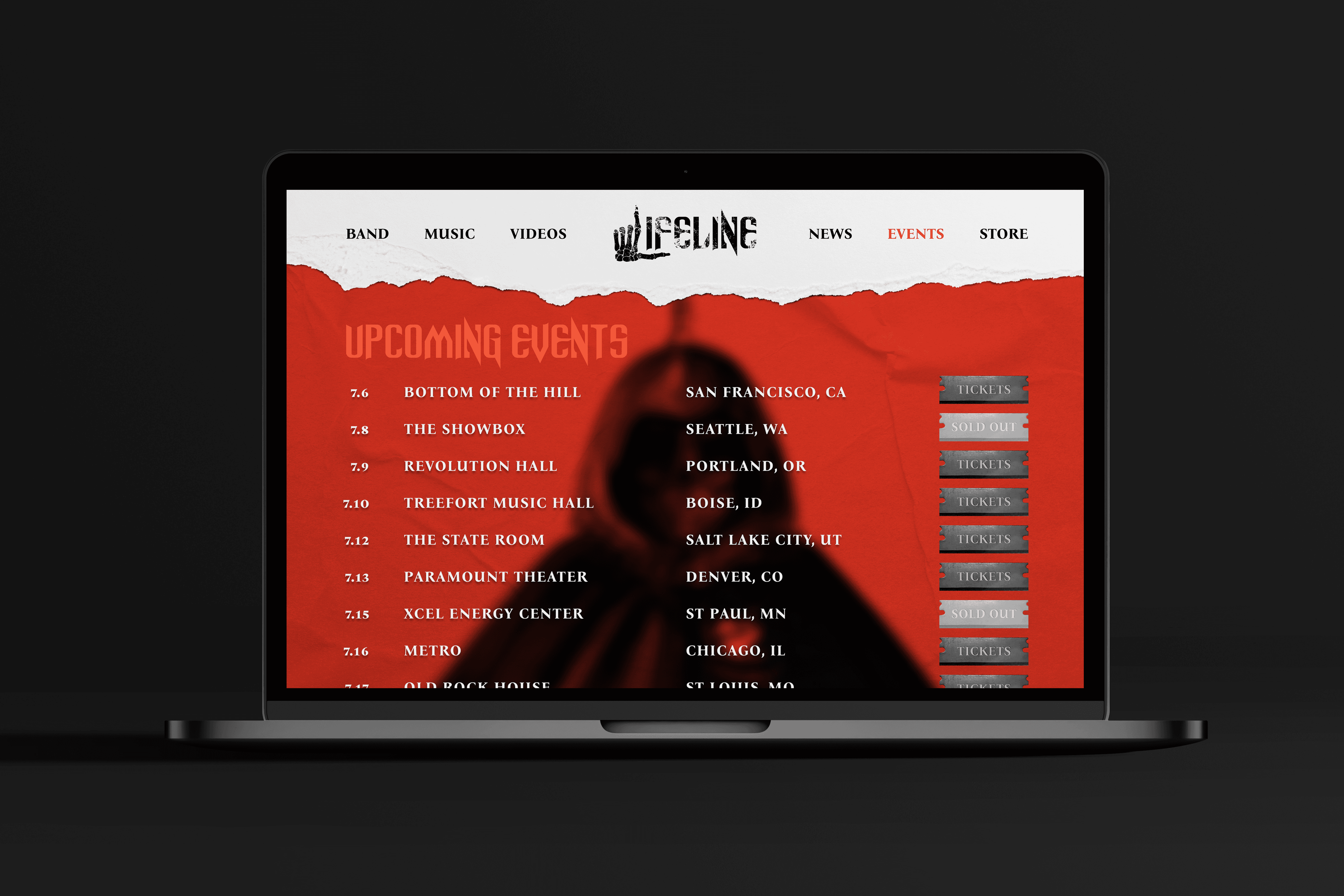


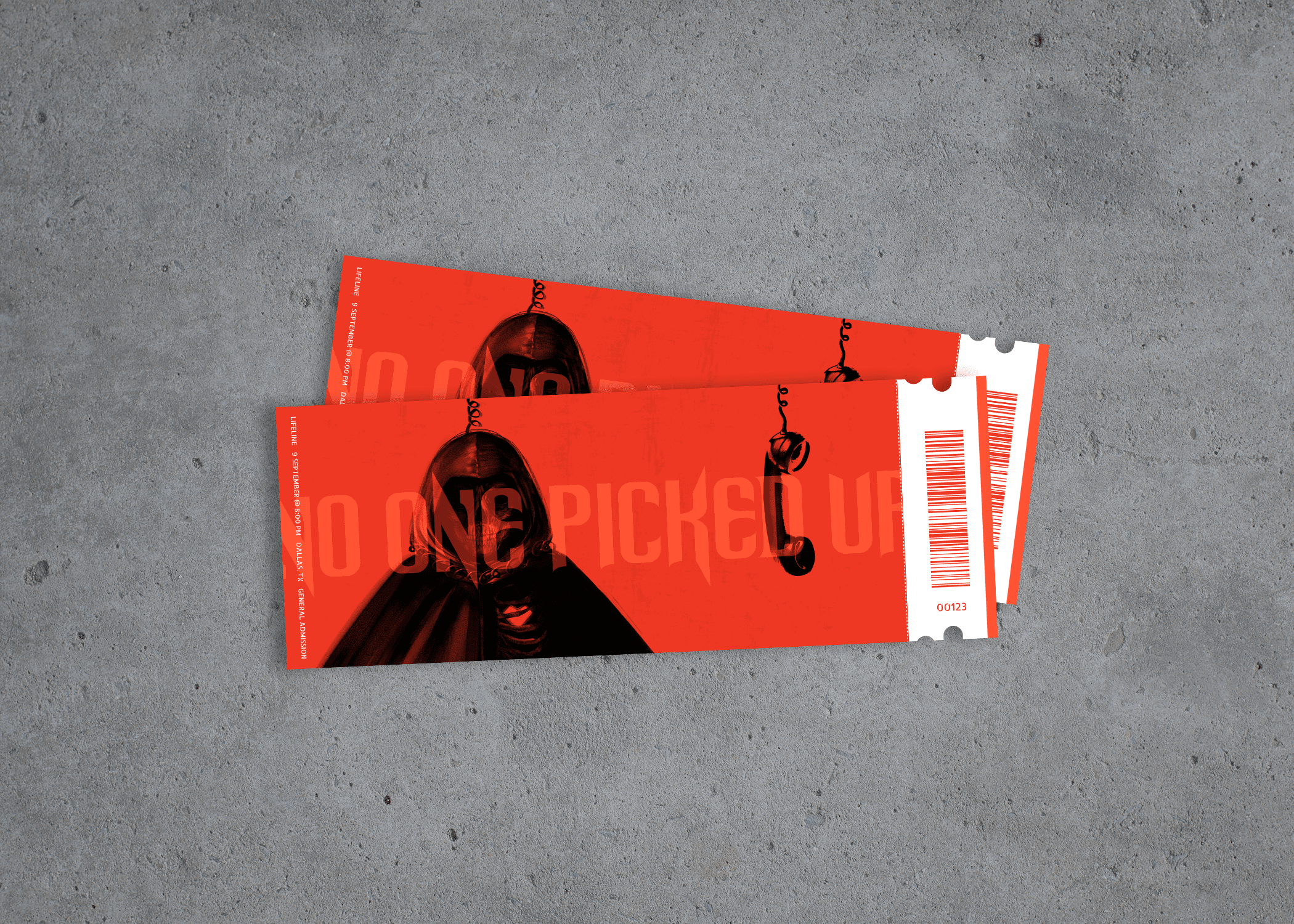


EXPANDED BRAND
EXPANDED BRAND
EXPANDED BRAND
