
Baking Change
Baking Change
Baking Change
Warm Fresh Muffins in Minutes
Warm Fresh Muffins in Minutes
Warm Fresh Muffins in Minutes
Graphis New Talent Awards 2025
Graphis New Talent Awards 2025
Graphis New Talent Awards 2025
branding
branding
branding
graphic design
graphic design
graphic design
package design
package design
package design
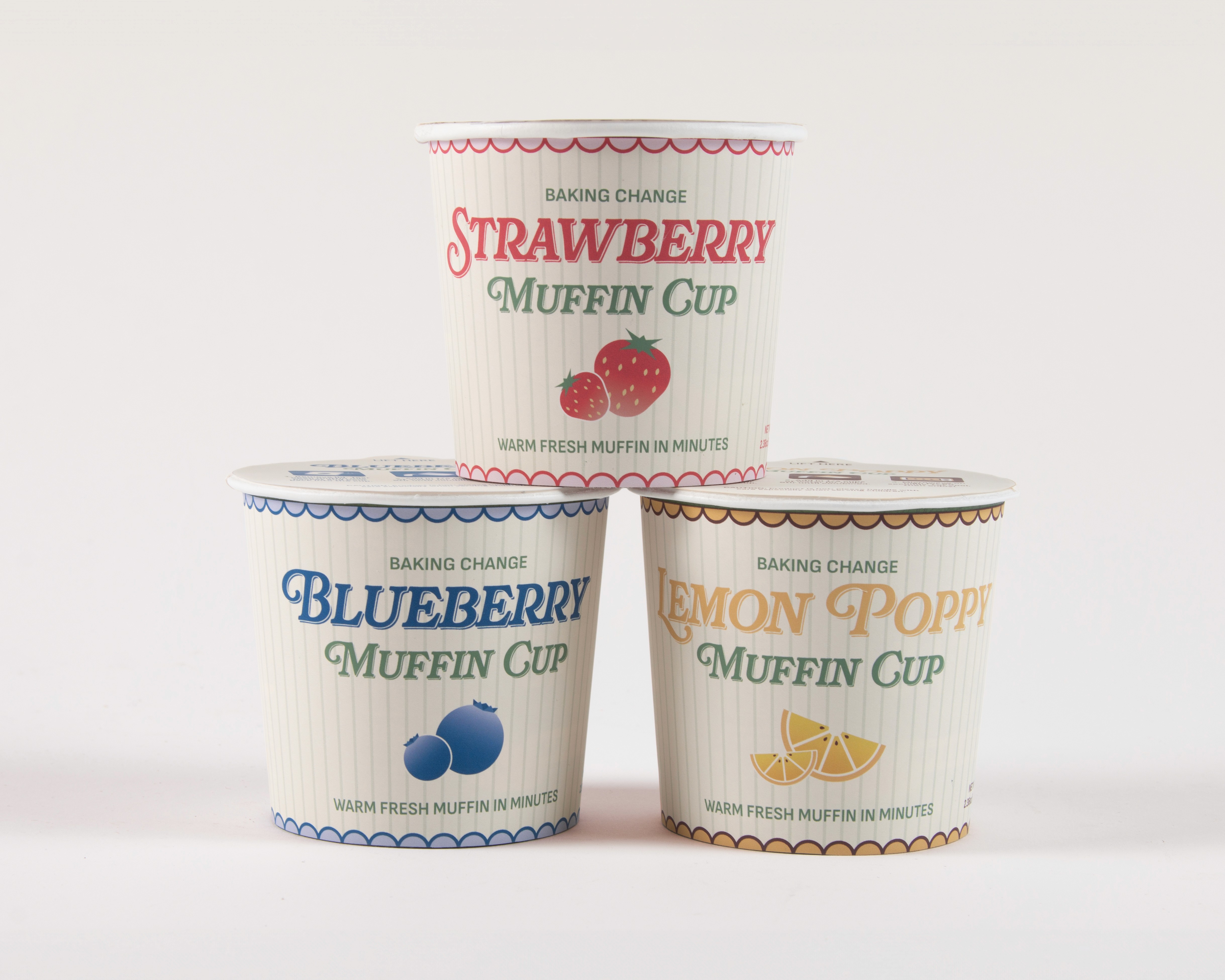
Baking Change is a sustainable muffin cup brand that offers eco-conscious, ready-to-bake muffins in biodegradable paper cups. Originally designed as a general muffin mix, the concept evolved into a convenient, waste-free solution.
I created the package design and developed a prototype to bring this eco-friendly concept to life.
Research
Research
Research
For the branding, I looked into vintage packaging, specifically focusing on old tobacco brand designs. I wanted to capture a nostalgic, slightly retro aesthetic while keeping the overall look cute and approachable. By analyzing these vintage designs, I was able to blend classic typography and subtle details with a modern, playful twist, ensuring the brand felt both timeless and charming.
For the branding, I looked into vintage packaging, specifically focusing on old tobacco brand designs. I wanted to capture a nostalgic, slightly retro aesthetic while keeping the overall look cute and approachable. By analyzing these vintage designs, I was able to blend classic typography and subtle details with a modern, playful twist, ensuring the brand felt both timeless and charming.
For the branding, I looked into vintage packaging, specifically focusing on old tobacco brand designs. I wanted to capture a nostalgic, slightly retro aesthetic while keeping the overall look cute and approachable. By analyzing these vintage designs, I was able to blend classic typography and subtle details with a modern, playful twist, ensuring the brand felt both timeless and charming.

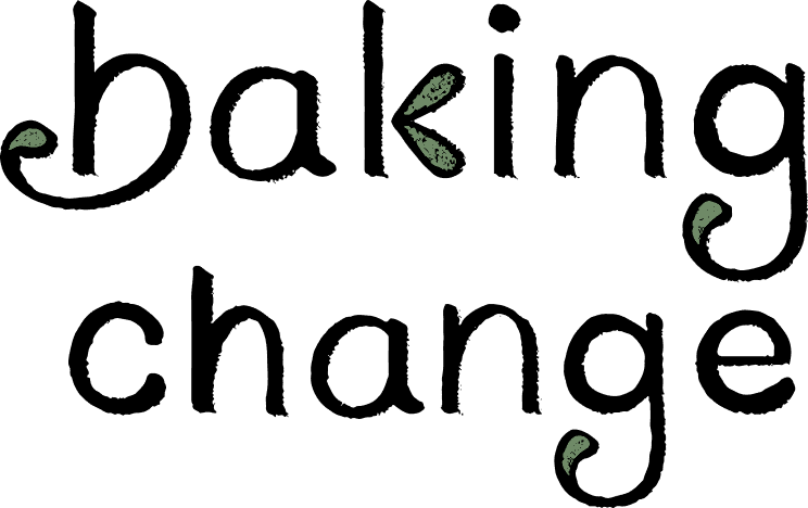
PRIMARY LOGOTYPE
PRIMARY LOGOTYPE
PRIMARY LOGOTYPE

STACKED
STACKED
STACKED
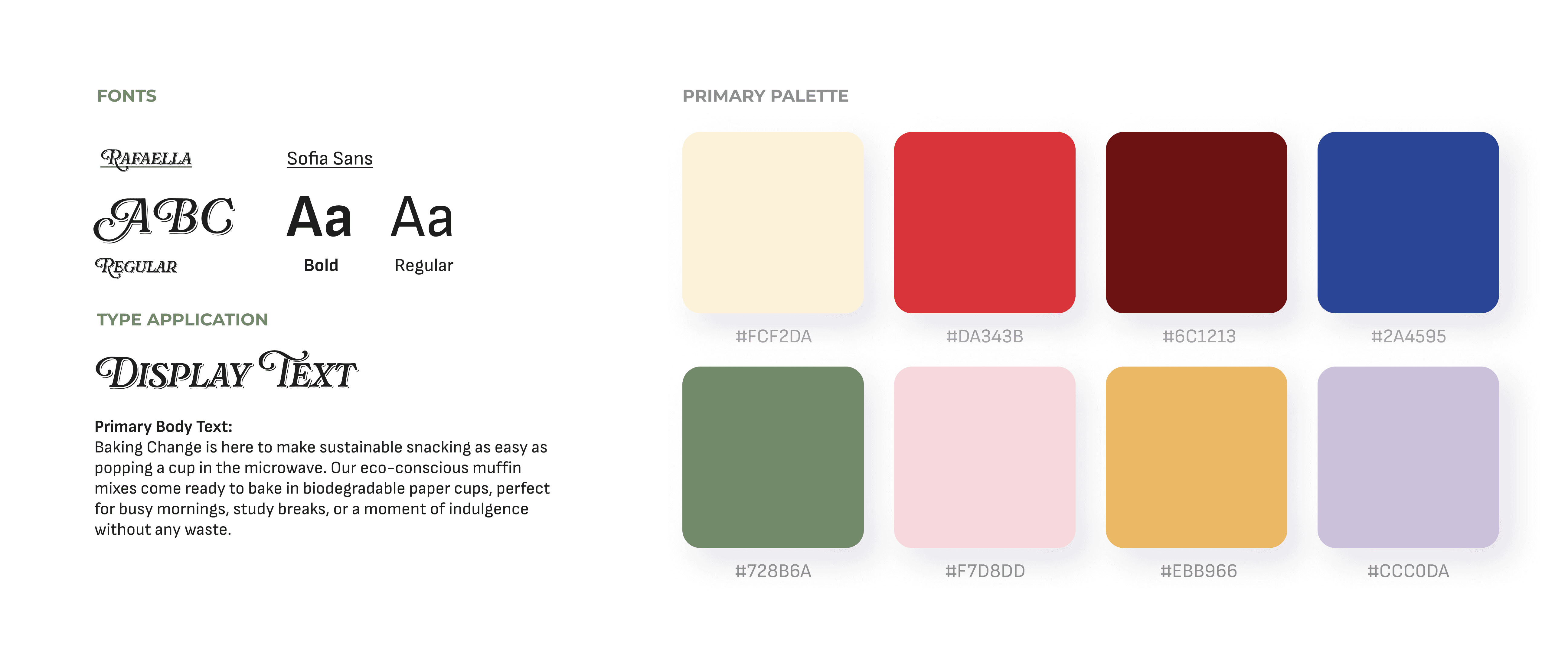

BRANDING PALETTE AND TYPOGRAPHY
COLOR PALETTE
BRANDING PALETTE AND TYPOGRAPHY


PACKAGING
PACKAGING
PACKAGING
TYPOGRAPHY


FRUIT ART
FRUIT ART
FRUIT ART

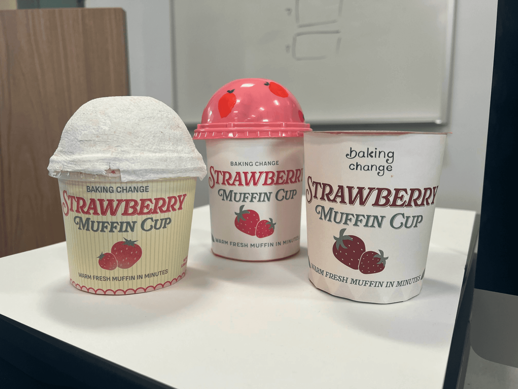
INITIAL SKETCHES AND PROTOTYPES
INITIAL SKETCHES AND PROTOTYPES
INITIAL SKETCHES AND PROTOTYPES


PACKAGING
PACKAGING
PACKAGING
